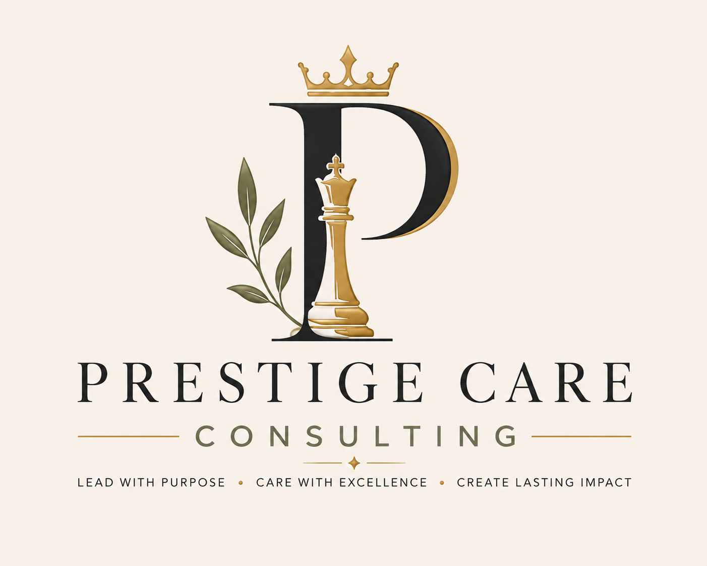
Nothing in Prestige was chosen by accident.
Every symbol, colour, word and visual element was designed to represent how we believe leadership, care and excellence should coexist: with strategy, humanity, integrity and purpose.
Symbols with intention.
The Prestige identity tells a complete story about how we think about leadership.
The Chess Queen
The queen is the most versatile piece on the board. She represents strategic vision, intelligence, range, adaptability and the ability to see the whole position before acting. At Prestige, the queen represents leaders who do not simply react to what is immediately in front of them — they think several moves ahead, protect what matters and lead consciously.
The Crown
The crown does not represent empty status. It represents responsibility. Leadership means carrying standards, making difficult decisions and being accountable for the impact we create. The crown reminds us that excellence without responsibility is only appearance.
The Letter P
The P sits at the centre of the Prestige identity: Purpose, People, Principles, Performance and Prestige. It connects who we are with how we work. Leadership starts with the person, but it must translate into systems, culture, quality and results.
The Branch / Leaves
The leaves represent growth, renewal, humanity and life. Prestige does not believe in cold or purely technical transformation. Systems matter, but people matter too. The branch balances the strength of the queen and crown with care, development and sustainability.
Gold
Gold represents value, excellence, quality and intention. It is not luxury for the sake of luxury. It is a commitment to raise the standard, pay attention to detail and deliver work worthy of trust.
Sage / Olive
Sage communicates balance, calm, maturity and growth. It represents how Prestige should feel: composed under pressure, human without losing authority, and strong without becoming rigid.
Charcoal / Black
Charcoal brings authority, clarity, structure and seriousness. It is the necessary counterweight to the human side of the brand. Compassion without structure cannot sustain quality — and structure without humanity cannot sustain people.
Cream
Cream creates space, calm and light. Visually, it represents our belief that strong leadership does not need to be loud. Confidence can be elegant, clear and intentional.
Five principles that guide how we work.
See the whole board
Do not treat symptoms in isolation. Look for the patterns connecting leadership, culture, systems, quality and results.
Humanity with high standards
Being human does not mean lowering expectations. It means creating the conditions in which people can meet better standards.
Strategy before reaction
Choose deliberately, using evidence and long-term thinking instead of operating permanently in crisis mode.
Excellence as a practice
Prestige is not a decorative name. It is an operating promise: review, improve, learn and continuously raise the standard.
Do what is right
Governance, quality, integrity and human dignity must coexist. What is efficient is not always enough; it should also be right.
“Prestige is the combination of strategy and humanity: think like a queen, lead with responsibility, and never lose sight of the people.”
The brand only matters when it shows up in how we work.
The queen becomes strategy. The crown becomes responsibility. The leaves become growth. Gold becomes excellence. Charcoal becomes rigour. Cream becomes clarity. Philosophy becomes behaviour.
This is what it means to be Prestige.
Lead with purpose. Care with excellence. Create lasting impact.
Explore how we work